 David Yates.
Twitter has recently unveiled a new design for the desktop web, to widespread condemnation. This is the usual response to website redesigns – see also reddit, Facebook and digg (RIP). In addition to an eye-searingly white new aesthetic, they’ve significantly reduced the functionality of their desktop website for desktop users, seemingly in service of making it look and feel more like a mobile app, a mistake previously made by Microsoft in 2012.
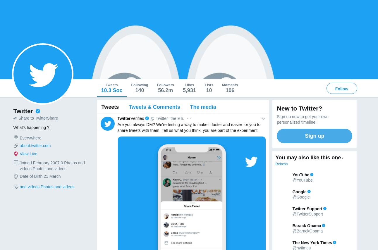
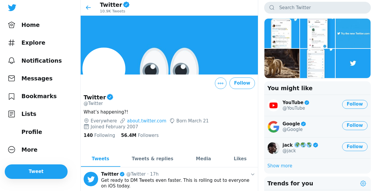
The most obvious way the new Twitter resembles an app is the fervour with which it squeezes every unique bit of page content into the central column, with navigational elements and other site-wide cruft in the sidebars.1 I’m all for readable line widths, but on a 1080p screen, the page content looks claustrophobic.2
Spacious and multi-tone
A little white box
A less obvious, more insidious change, is the increased use of JavaScript over standard HTML,3 resulting in a lose of standard mouse functionality in the browser. You can no longer middle-click an embedded retweet to view it in a new tab, nor can you you open it in a new tab through the right-click menu. You can only left-click on it to view it in the current tab, bringing us back to the days of tabless browsing, circa 2001. Or rather, to the Twitter app on your smartphone.
Also suitable for the app but questionable on the desktop are the gigantic new navigation buttons, optimised for fat fingers rather than a mouse pointer. Why no-one thought of applying this logic to tweet permalinks, which are still only accessible through tiny timestamp links, is a question for the ages.
There’s also a strange artificial restrictiveness/misdirection to some parts of the interface, such as the tweet entry box, which looks like a text entry field but is actually just a big button that produces a popup with the real text entry box.4
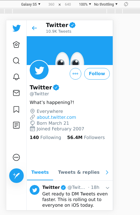
Unsurprisingly, the new Twitter looks best in browser devtools smartphone view (pictured above). But dare to visit it from an actual phone, and Twitter will screech at you to download its mobile app. Which raises the question: why? Why develop a mobile-first experience for a platform you don’t want people to use on mobile? Probably for the same misguided unification of experience goals that Microsoft profusely apologised for by bringing back the start menu five years ago. Different devices have different purposes and user experience affordances: beyond the complexity level of, say, this read-only website, unity of design across platforms is a one-size-fits-none solution.
This is something of a throwback to 00s webdesign. ↩︎
This design also has practicality implications: before, the “followers you know” widget was given enough space to allow you to navigate directly to those profiles – now it’s been collapsed into a button that takes you to a separate “followers you know” screen. ↩︎
Amusingly, the linked article complains about the old Twitter design. ↩︎
This was changed to a more sensible design shortly after this article’s publication. If only the same could be said of the rest of Twitter. ↩︎