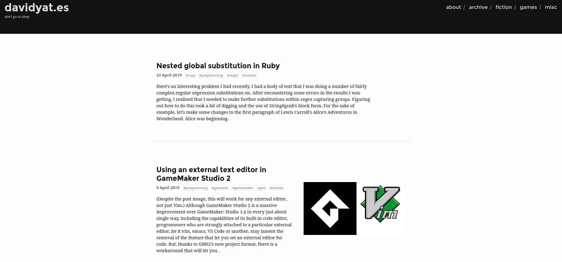
 David Yates.
I’ve completely overhauled the design of this website for the first time since I switched from the Landscape theme (Ghost version) to a custom theme in 2016.1 Previously, the home page looked like this:
As of this blog post, the home page looks like this:
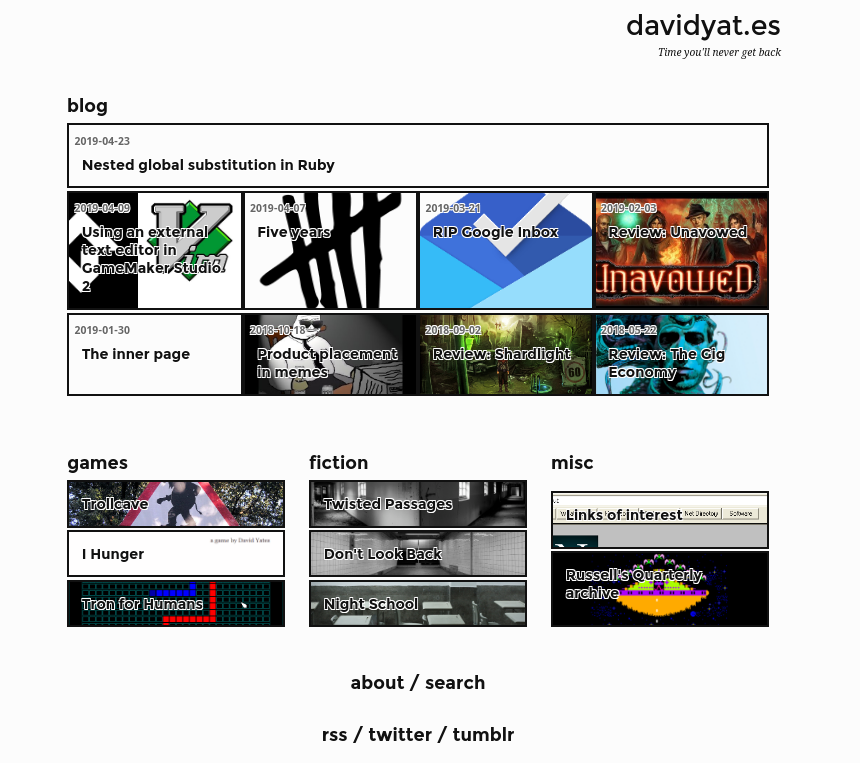
The content is a lot denser, and I’ve gotten rid of those awful unformatted post excerpts that I could never quite tweak to my satisfaction. In their stead, I’ve gone all in on the picture boxes I’ve been using around this site for archive lists and the previous and next post links. I really like the picture boxes – they add a bit of colour and flair to what would otherwise be an entirely monochromatic design.
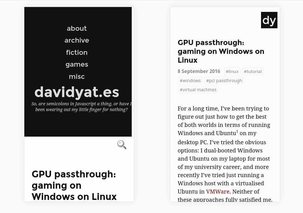
Actual content pages have also been overhauled, but to a lesser extent.
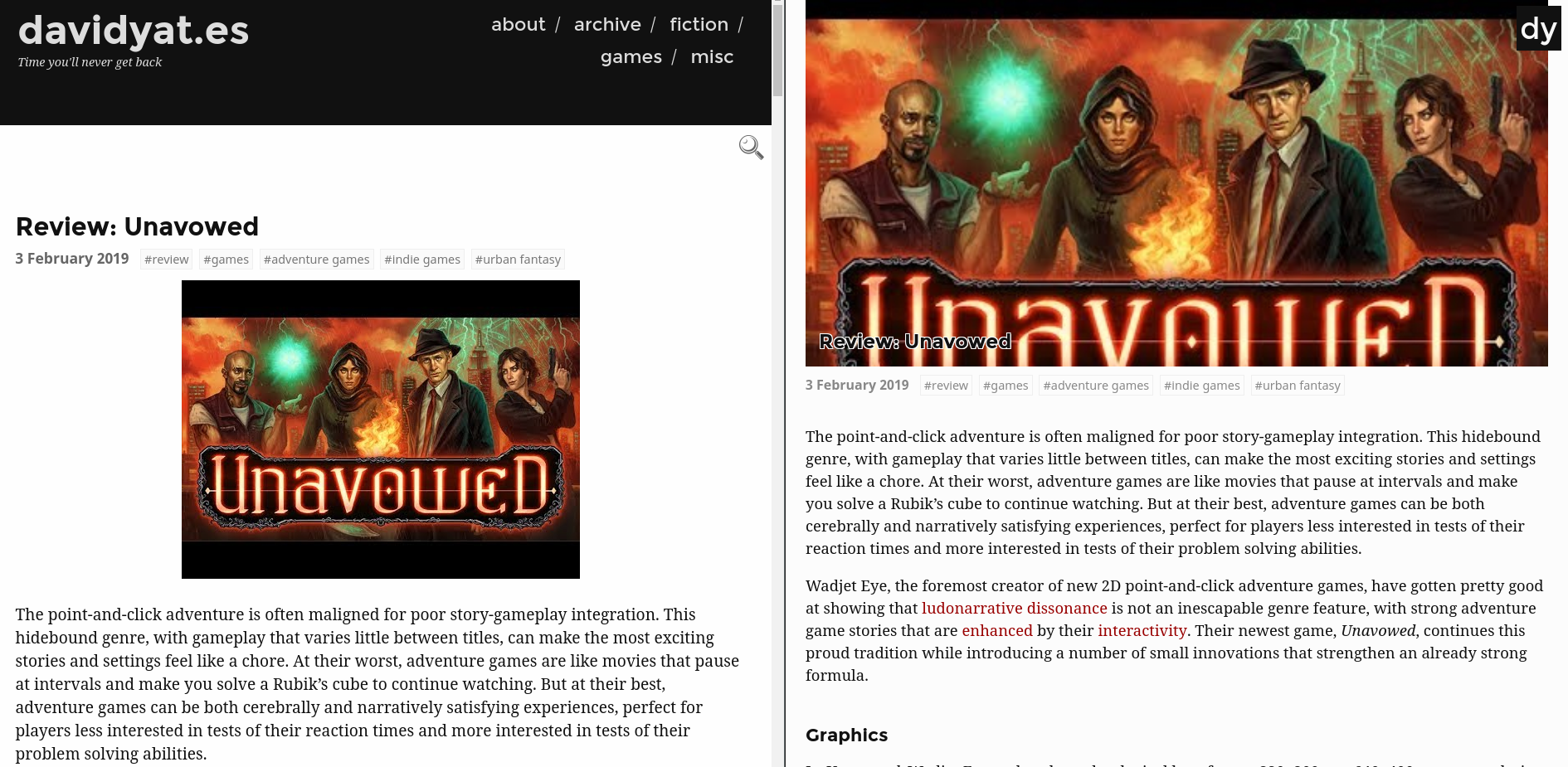
Old vs new: less navigation cruft, more space for actual content.
This redesign was prompted by some thoughts I had about web design, and the trend away from what I’m gonna call frame-based layout.
When the web was young, webpages were just HTML documents. You put up a document with some content in index.html, and that was your home page. You put some other documents in the same folder and linked to them. Each one was carefully handcrafted and likely bore little resemblance to any other. This made defining navigation and branding tedious: if you wanted a set of links or a logo somewhere on all of your pages, you would have to include those things in every single page, and update every single page every single time you added or changed any of it. The same was true for page headers, footers, and other branding.

A typical 90s homepage.
Luckily, webpages live on computers, meaning you can generate them with code rather than crafting each one by hand. Hooray! For a website at any scale greater than a couple of pages, you want to be able to define layout and content separately. To make sure no-one gets lost in your website, you can make this layout include a link to every major page, and you can have a standard place for advertising, nice site headers and footers, further links in sidebars, and so on, making every one of your pages uniform and easy to update. And that’s exactly what everyone did.

Every single website made between 2000 and 2009.
Around 2010, though, people started realising how cramped this design was. Every single page looked the same, giving sites a strong brand identity, but the actual content of each page – the sole reason for that page to exist – was squeezed into a tiny space in the middle, surrounded by a whole bunch of generic fluff.
The three-column layout is now firmly anachronistic. Most modern websites use only one or two of the generic elements – a header and footer (like this site), or a header and right sidebar, or even just a left sidebar (although there’s usually at least a small, unobtrusive footer). Sometimes these elements are hidden by default, requiring a scroll or mouse-over to pop into view, and in a growing number of blog designs, every effort is made to minimise their size and prominence. Each page’s unique content should be the overriding focus of that page – especially since most web browsing is done on tiny screens these days. Being a slave to fashion, these are exactly the things that inspired me to design this new theme.

Fashion really is a cycle. I wonder when <marquee> will come back in style?
Websites probably should have a consistent appearance from page to page, but does every single page have to look the same? Site navigation definitely should be possible via links and buttons (rather than guessing at URLs) but does every page need to link to the same set of major indexes? Is that reflective of the way people actually use the site? I’ve answered no to all of those questions, put all major navigational stuff on the home page (and other subordinate index pages), and removed it from the content pages. Now, rather than having to scroll past a bunch of generic links on every page, mobile users can get right into my hot opinions.
I’ll miss the taglines on every page, but that’s the price of progress.
Now that I’m no longer using it, I’ll be cleaning my old theme up for use by others. Keep an eye on Hugo Themes if you actually liked the old design. ↩︎