 David Yates.
Substack is platform for creating email newsletters that people pay money to read. The platform was inspired by Ben Thompson’s Stratechery and has largely supplanted Medium as the modern, trendy place to publish. Unlike Medium, it has a clear funding model that doesn’t change every six months. It also doesn’t attempt to present itself as a singular, homogeneous platform – individual Substack sites have their own subdomains and even a limited amount of custom styling.
Substacks are email newsletters first and foremost. Visit just about any stack, and the first thing you see is a full-screen pop-up asking for your email address.
Please commit to receiving emails from us before reading a single article.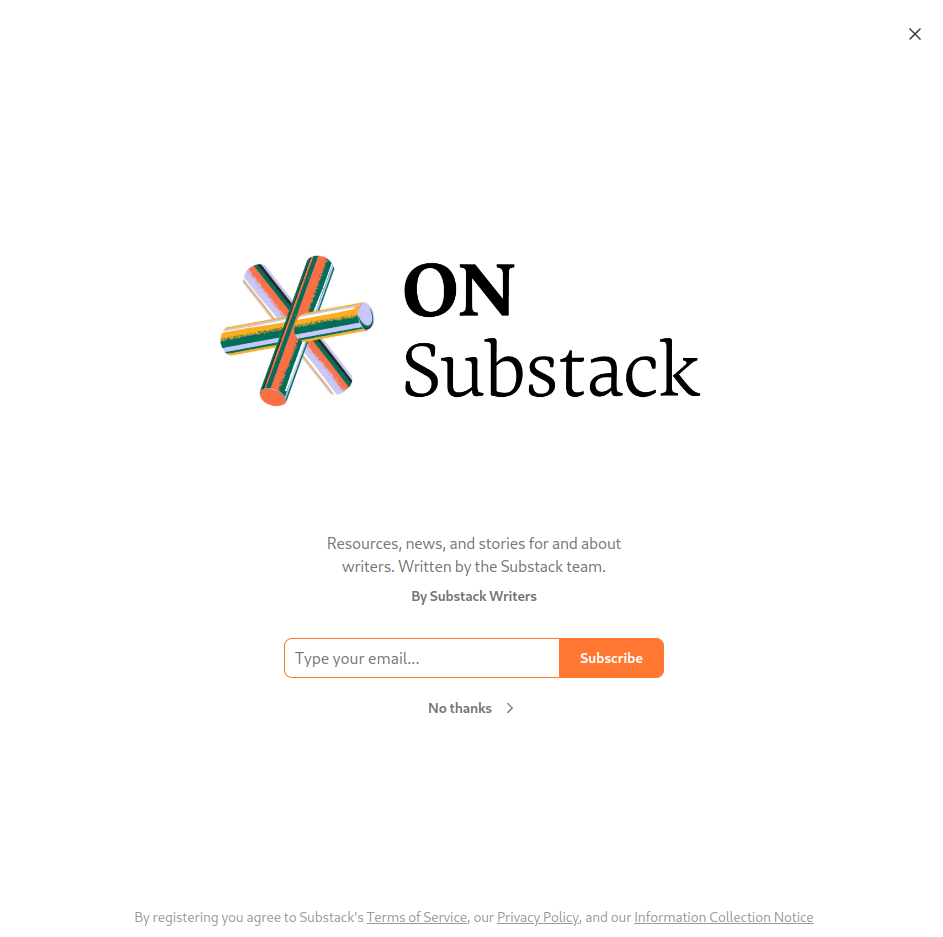
Start reading an article, and you’ll get an overlay pop-up asking the same thing once you scroll past the first screen of text.1
Are you ready to commit to receiving emails from us now, after reading three paragraphs?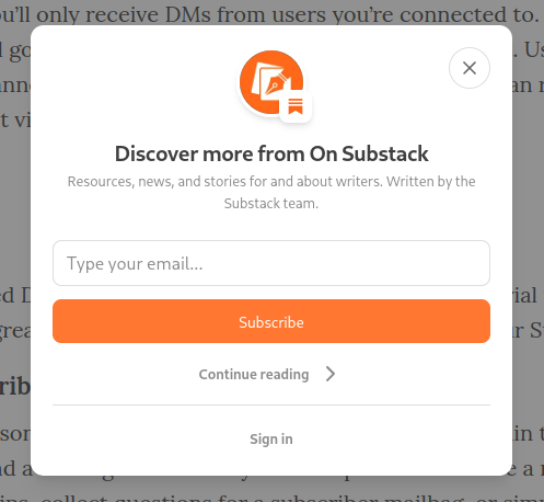
Switch to another tab and come back later, and you’ll have to click through the first overlay again to get back to your article.
Ready to subscribe yet, huh, huh?!
All this is highly irritating to me as a person who reads many Substacks but categorically does not want to receive them as emails. To their credit, Substack provides RSS feeds for their newsletters, allowing me to subscribe to ones I like using Fraidycat, where they appear among other blogs and extra-special social media accounts I follow in the same way. In other words, Fraidycat gives me a screen full of Substacks, listed vertically, showing links to the ~5 most recent posts from each horizontally, something like this:
- Substack #1
- Post / Post / Post / Post / Post
- Substack #2
- Post / Post / Post / Post / Post
- Substack #3
- Post / Post / Post / Post / Post
- Substack #4
- Post / Post / Post / Post / Post
- Substack #5
- Post / Post / Post / Post / Post
The horizontal list can be expanded in-place to a vertical list of ten. This seems to me like a very sensible way to display this information: here are the blogs you’re interested in and here’s what each one has posted recently, all on one screen.
Recently, I made a Substack account and officially subscribed to everything I read,2 mostly to get rid of the email nag screens.3 Secondarily, I was interested in what the reading/subscription management user interface was like. As it turns out, there are a few different interfaces for this:
- Home
- This shows a gallery of recent posts by newsletters you’re subscribed to at the top, and Substack’s Twitter clone named Notes at the bottom. Posts on Notes mostly consist of authors linking to their Substack articles, but sometimes to other articles. Other users can reply to these posts.
- Inbox
- This shows a list of posts by newsletters you’ve subscribed to, sorted by recency. For the most part, posts only appear in the Inbox if they were published after you subscribed, but if you pay for a subscription, you’ll get a few older posts after your first payment goes through.
- Chat
- This shows an interface that looks a bit like Telegram. Subscriptions are shown as channels, and posts in these channels largely consist of authors linking to their Substack articles. Users can reply to these posts.
- Library
- This shows a list of Substacks you’re subscribed to, differentiating free and paid subscriptions. You can also make a list of “saved” posts.
Of these four interfaces, three appear to be half-baked copies of other apps and all are vastly inferior to the nested list I’m accustomed to. The inbox view provides a firehose of content, sorted only by recency and filterable only on what you’ve paid for and what you’re getting for free. It also doesn’t show you anything from before you subscribed to a given newsletter. The library view is a simple list of bookmarks. And the Twitter and Telegram views cloud the actual newsletter content with other nonsense that I could get on Twitter or Telegram or one of their five million other clones.
What’s worse, these different interfaces scatter user replies – users can leave a public reply to a given post in one of four ways:
- As a comment on the post itself.
- As a reply to the post announcement on Notes.
- As a quote of the post announcement on Notes.
- As a reply to the post announcement on Chat.
1 and 2, at least, appear to be different views of same thing, but the other two seem like an unnecessary dispersion of discourse within a single website.
Each of these interfaces was designed to mimick another application, and one with a different purpose – an email inbox, Twitter, an instant messenger. Each one is suboptimal at the task of showing me a digest of the blogs I’m interested in and what they’ve put out recently.
Substack is also terrible at making older content accessible. The Archive screen on each stack is an endless scroll, with no way to see posts from any particular time. You just have to descend with a patient scroll-wheel and watch Substack’s JavaScript gremlins spend multiple full seconds on the tough wizardry of… rendering a handful of images and a few lines of text.
The point of my RSS post was that email newsletters were a regression from what came before. I still think that’s true. Substack seems almost specifically designed to hit the criticisms in that piece – they started with email newsletters, and then built Twitter newsletters and Telegram newsletters on top of that, aping the limitations of each format. This is toxic skeuomorphism, though it’s aimed at other digital interfaces rather than physical objects.
It feels like Substack looked out at how newsletters and blogs were being distributed and read on the web and then directly copied a few of those methods rather than considering whether they could create something better, or what an interface for following and reading newsletters/blogs might look like if it were designed from the ground up.
Maybe this is just me complaining that Substack has failed to cater to my particular and idiosyncratic whims (how dare they!) but these weird and suboptimal interfaces did really baffle me, and I thus have retreated from the app built by a $650 million Silicon Valley startup to the superior UX of this open source browser extension made by one person.
Even worse, Substack chose to spite me personally by changing the appearance of their nag screens right after I took these screenshots but before I finished writing this post. ↩︎
You can subscribe to newsletters and not receive them as emails through the site’s “Disable all emails” setting. ↩︎
When setting up Astral Codex Ten, Scott Alexander got Substack to implement a feature disabling the email nag popup. This is sadly not the default setting and I haven’t seen it used by anyone else. ↩︎