A few days ago, the Ghost blogging engine reached version 1.0, a significant milestone in the development of any piece of software, especially in today’s eternal-beta world. Though I no longer use it, I’m invested enough in its development to mark the occasion.
For the first couple of years, this blog ran on Ghost, and it was good. Truth be told, I started this blog for no grander purpose than because Ghost looked cool and new and I wanted to try it out on my Github Student Pack-funded DigitalOcean server. And I continued it for no grander reason than because the editor was impossibly beautiful.
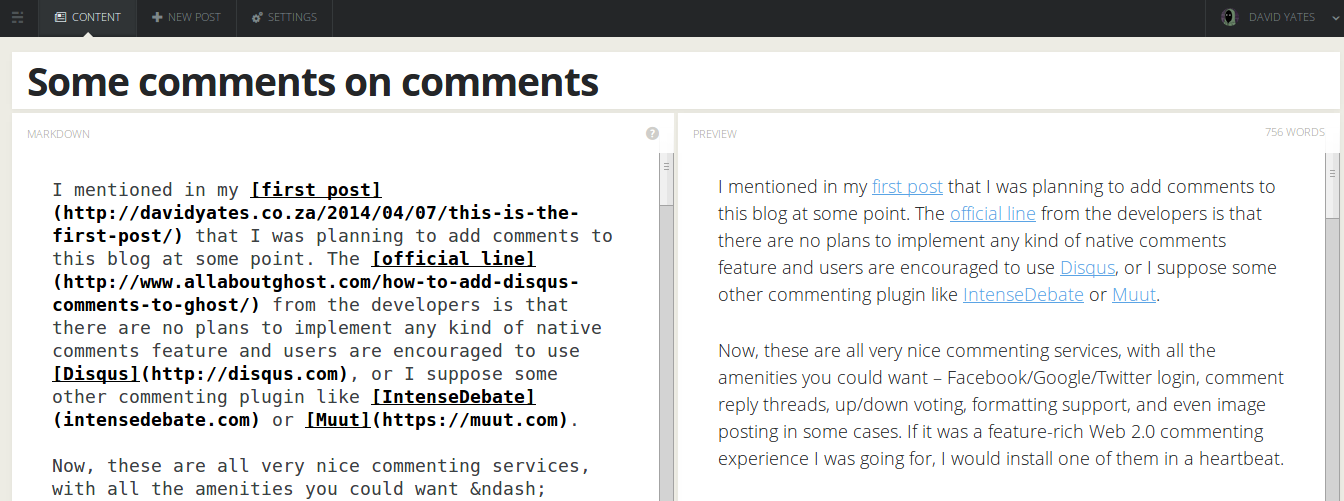
Angels weep at the sight of this Platonic ideal of the two-pane markdown editor.
When I started this blog, the latest version of Ghost was 0.4.2. It lacked many basic features, such as a built-in navigation bar – you had to include that in your theme’s HTML if you wanted anyone to find your site’s non-blogpost pages, thoroughly ruining the separation of presentation and content. There was also no reasonable server-side way to provide links to the next and previous posts. But it was early days, and these issues were remedied after a while (0.5.9 and 0.6.0 respectively).
I dutifully upgraded my Ghost installation to every new version, delighting at new features such as Markdown footnotes and post previews. And then came 0.7.0, and with it an overhaul of the admin interface, including my beloved editor.
This appeared innocuous enough at first. The editor was much the same, but now there was a permanent navigation sidebar on its left-hand side.
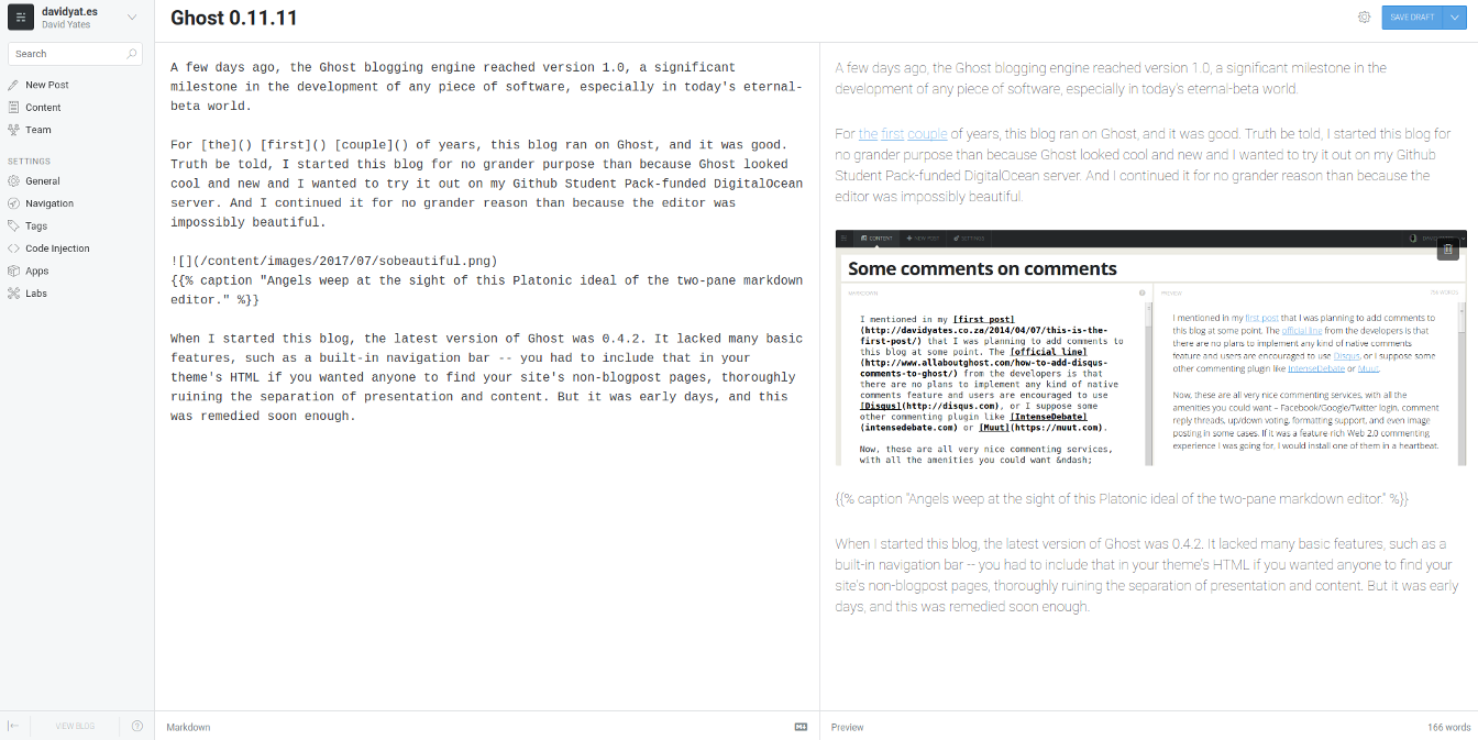
I spun up Ghost 0.11.11 to take this screenshot because I didn’t want to fight too much with Nodejs versions. Regardless, it looks much the same.
Irritating, but a button in the bottom-left corner allowed you to hide it. With this done, the editor actually looked even better than before – no navbars, no clutter, just me and my text.
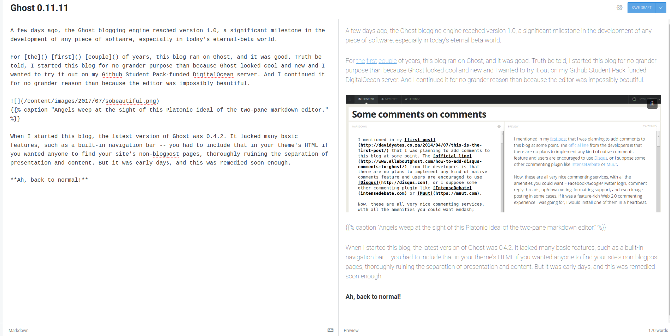
This is nice.
Everything was perfect until I inadvertently brought my mouse cursor too close to the left-hand side of the window. With a quick swoosh the sidebar returned.
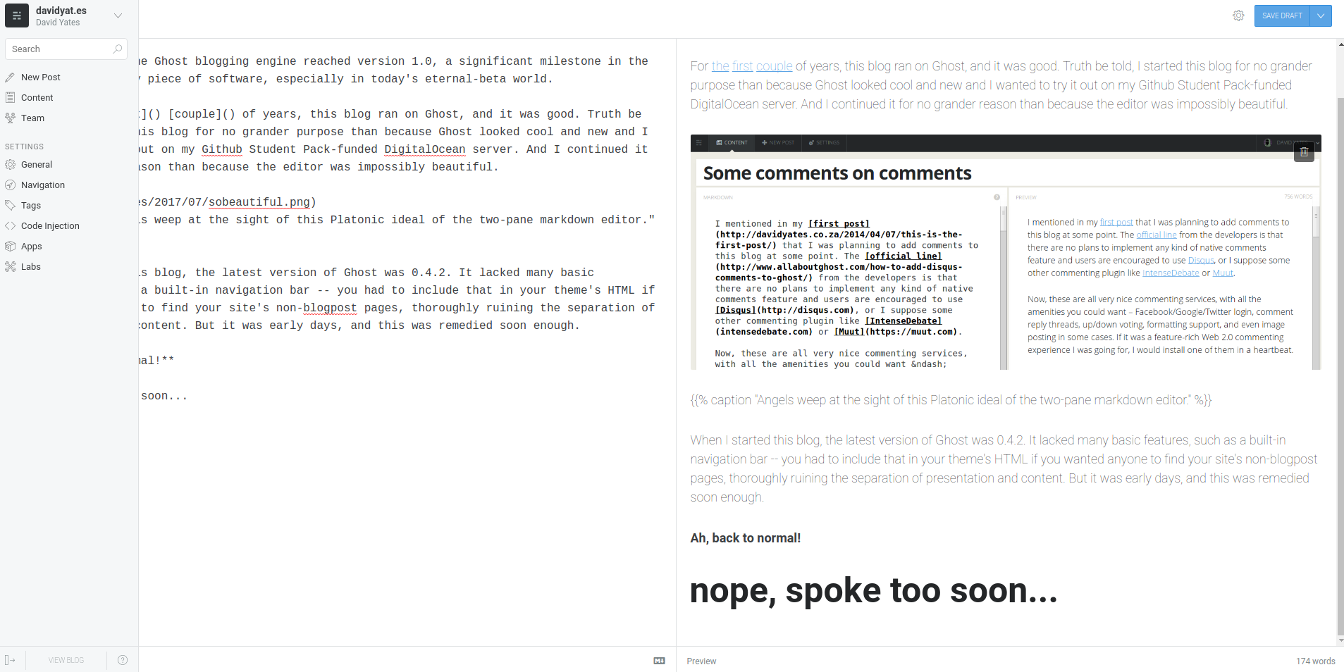
It’s back!
The sidebar did disappear again once I moved my mouse off it, but the idea of bringing it sailing in to obscure my text every time I moved my mouse to the left without pixel-perfect precision was completely intolerable. I immediately reverted to 0.6.4, and left a complaint about the change on the Ghost devblog, already making plans to switch to an alternative engine. I recognise that this is a deeply petty reason to abandon a piece of software, but there are a hundred blogging engines out there, and if I was in the habit of letting software updates dictate changes to my workflow I’d install Windows on my PC or buy a Mac.
I was already somewhat concerned about the security of Ghost1 and was beginning to dislike the overcomplexity inherent in hosting a webapp that 99% of people interact with entirely passively. The interface thing was just the last straw that tipped the scale on the camel’s back towards me not using Ghost anymore. So I switched my site over to Hugo and never looked back…
Until now. I spun up an instance of Ghost 1.0.0 just to see what it looked liked since I’d abandoned it, and found…
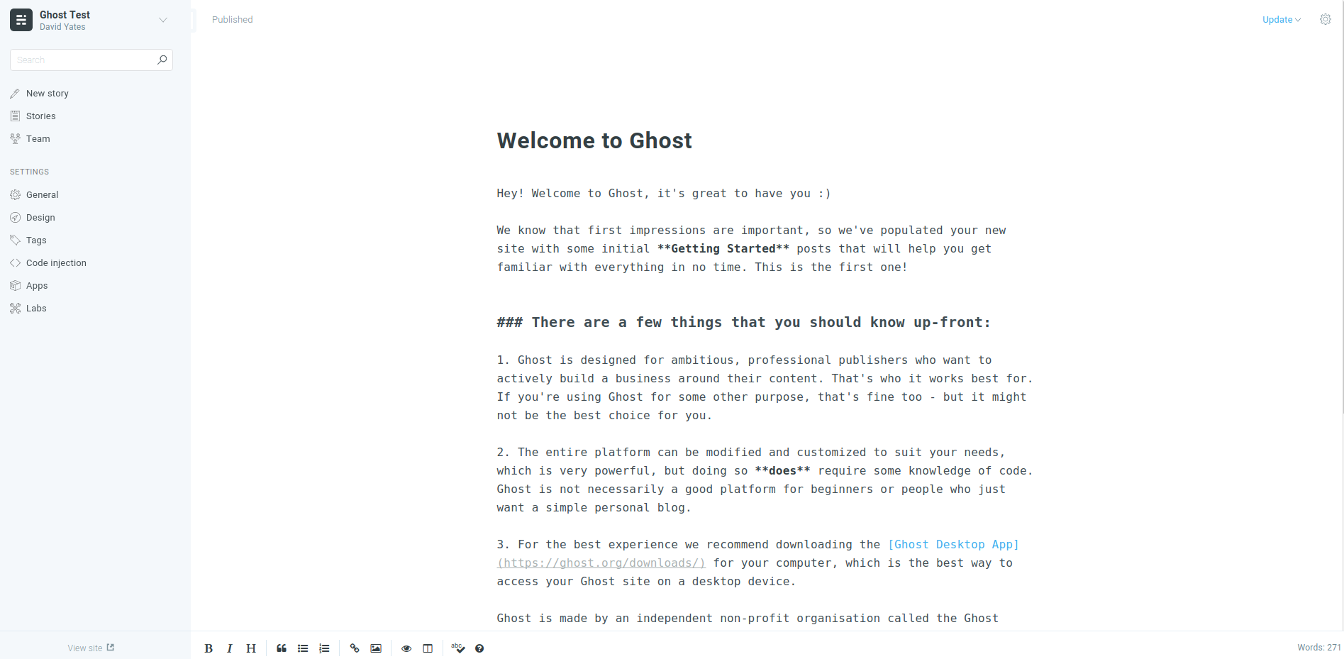
oh no they made it worse
…a little button labelled …
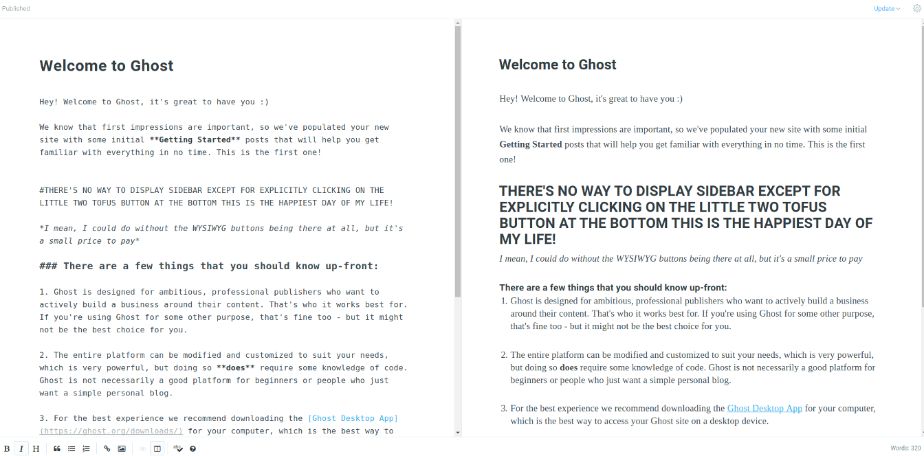
A return to perfection.
Once again, my two-pane editing experience was unmarred by swooping sidebars. They listened! It took a while, but eventually they listened!
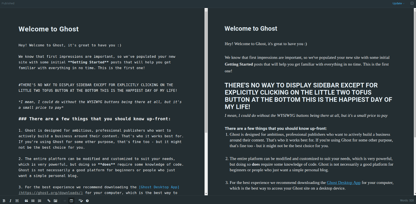
There’s even an attractive nightmode now.
Ecstatic as I am about this, I’m not going to switch back to using Ghost for this blog.
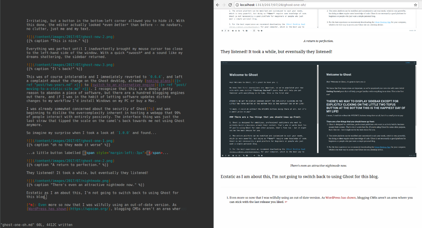
Maybe not quite as beautiful, but it has other strengths.
As I detailed at length in my static site generator post, Hugo’s content model provides a great deal of flexibility that I’ve come to depend on. Were I to move back to Ghost, I’d have to manually populate things like the archive and features pages, because Ghost’s content model begins and ends with pages, posts and tags. That, or I’d have to write a plugin.
One of the many posts I started writing for this blog but never ended up publishing was a tutorial on writing Ghost plugins, or “apps”. “App” being a hip modern buzzword meaning “set of HTML pages wrapped in a gimped version of Chrome and given a launch icon so as to clutter your smartphone’s homescreen” rather than “set of scripts for adding specialised functionality to your hipster minimalist blogging engine”, this is an especially poorly named feature.
I wrote a couple of apps, one to format the text of posts and pages with David Merfield’s Typeset.js module, and another to display at random one of my large collection of silly taglines in the site header.
The first one is kind of shoddy because I implemented it by writing new Handlebars helpers, rather than as a filter to the existing Handlebars helpers. This meant that anyone using the plugin would have to change their theme to use my specific helpers for really core functionality of Ghost: displaying blogposts. Yuck. I think I had a good reason for doing it that way at the time, but if not, I literally used the wrong one of the only two features the Ghost app platform provides.
The second one I never even released publicly because it was just a Handlebars helper with a hardcoded list of descriptions. To make the app palatable for public use, I’d need to create a custom page on the admin panel allowing users to add and remove random taglines. Which I would have done even just for my own convenience, but the Ghost app engine provided no functionality for it.
In 1.0, this appears to still be the case. Despite the many updates between the last time I used Ghost and now, apps are in precisely the same state as they were then, their wiki pages still peppered with messages saying alternately “This isn’t done yet” and “We may rewrite this from scratch later”.
Features versions of Ghost between 0.7.0 and now have added include:
- Slack integration!
- I imagine this to be the modern equivalent of that annoying guy in IRC channels who would have a plugin that posted the song he was listening to.
- Twitter and Facebook stuff!
- Considering I explicitly removed sharing buttons from my last non-custom theme, this would be of no use to me.
- Accelerated Mobile Pages!
- This subject borders on needing its own post, but briefly: the solution to slow pages on mobile is to debloat the original pages, not to host everything on Google – AMP is the worst case of tulip subsidies on the web right now. Frighteningly, use of this feature could only be disabled a few releases later.
- Subscriber email harvesting!
- That we use email newsletters in 2017 is a testament to this not being the best of all possible worlds.
- Scheduled posts!
- This is actually a good and useful feature, no snark here.
And of course the second major redesign of the admin interface, which I like on balance.
Just browsing through the releases page on Github leads me to realise that despite what I might have liked about Ghost when it was first released, the developers have always had priorities entirely orthogonal to my own. Any project that implements Slack integration and email harvesting before post scheduling clearly exists in a world very different from mine. That I found much to like at all, I think, is an artefact of how early on I adopted Ghost.
Even the editor is at the start of a massive overhaul to basically turn it into Medium.com’s editor (credit where due, Medium has the least awful web-based rich-text editor). It looks very nice, of course, but I’m obsessively attached to perfectly happy with two-pane Markdown and preview.
But then, Markdown is for programmers. As this commenter notes, using Markdown competently requires a programmer’s intuition about the way the parser processes your text, and its killer feature – ease of typing – is worthless to the vast majority of people, who format text by clicking on toolbar buttons like in MS Word.2
Ghost, in the very early days, was also for programmers. You had to be comfortable with the commandline and webserver configuration to get it deployed, comfortable editing HTML to put custom stuff in your theme, and comfortable with Markdown to write formatted posts. But now there’s a fancy client that handles automatic deployments down to configuring nginx for you (!) (plus the managed Ghost Pro service if you don’t event want to touch a terminal), most of the need for editing themes is gone and Markdown is on its way to being the second fiddle editing method.
This makes total sense for what Ghost is positioning itself as: WordPress for people who really like Medium, but presumably want their own URL and a bit more theming flexibility. I wish the project every success, and if it can overtake Medium, the world will be a better place: at least it’s open-source and every blog doesn’t look the exact same.
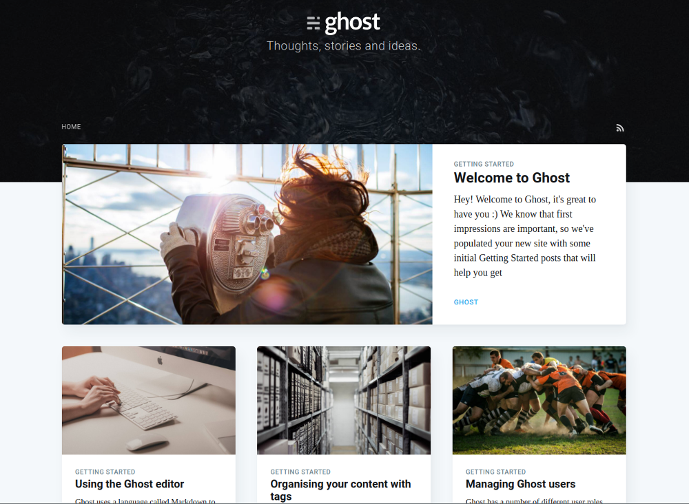
The newest version of Casper is almost too beautiful to be a default blog theme.
 David Yates.