Everyone who’s used a computer operating system (whether Windows, Mac or the more popular desktop Linux distributions) knows what windows are. When your computer starts up, you’re greeted with a blank desktop, and in order to do something with it, you open up one or more applications, which, in a bit of a mixed metaphor, appear as “windows” on top of your desktop. You can move these windows around, hide them, and expand them to the full size of the desktop.
At first, the whole point of windows appears to be having a lot of stuff open at the same time, all scattered about and overlaying each other.
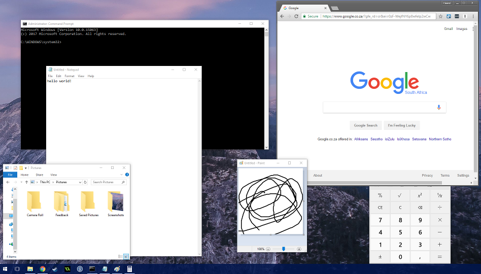
Just as Xerox PARC intended!
But as soon as you really want to get anything done, you end up fullscreening one of those windows and just working with that.

It took a little longer than Andreessen predicted, but Windows is finally just a poorly debugged set of device drivers for running a web browser.
Or, if you need to take notes while you browse the web, maybe you’ll snap notepad to one side of the screen.
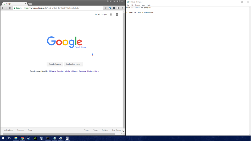
The photos of my screen weren’t coming out nicely.
And now that you’re using Windows 10, corner snapping is a possibility, so you can work in four different applications at once, should you feel like it.
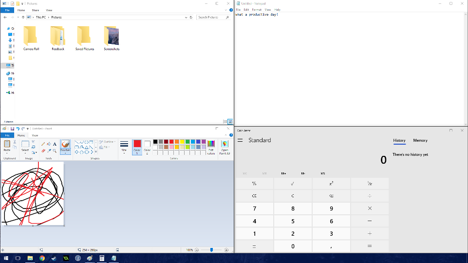
Productivity mode: engaged.
Congratulations! You’ve turned your back on traditional floating window management and are now using a tiling window manager. But you had to manually drag a bunch of floating windows around to do so.1 If only there was a better, more efficient way…
There is. But we’ll need to journey to *nix land to discover it.
Tiling window managers are a lot like old text editors: weird and off-putting at first, but extremely powerful and comfortable if you can get used to them. In the same way that a Vim user will miss vi-keybindings in any other text editor, someone who uses a tiling window manager long enough will come to miss its particular workflow if they go back to a more mainstream floating/compositing window manager.
In the sections below, we’re going to discuss the main benefits of tiling, taking a look at the approach of different tiling window managers to each of them.
# Window arrangement
Individual tiling WMs differ, but all perform the same basic operation: automatic arrangement of windows to take advantage of all available screen real estate. If you’ve used a terminal multiplexer before, it’s basically that but for your entire system. Let’s take the default xmonad configuration as an example.
The first window you open will be maximised. If this is all you need, you’re sorted.

No prizes for guessing what distro archie’s running.
The second window you open will take up half the screen space, pushing the first window into the other half. Thus, you automatically get a useful layout analogous to side-snapping windows in Windows.
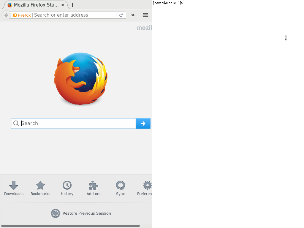
Alright, time to get stuff done!
The third window you open will again take up half the screen space, pushing your last two windows into the other half.
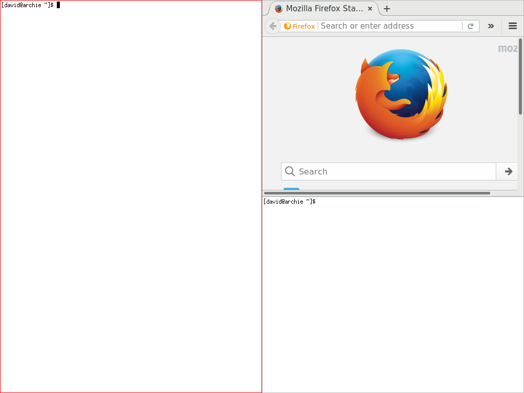
You can never have enough terminals.
And so it goes…
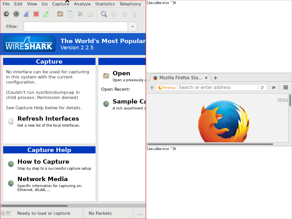
archie is somewhat hard up for visually distinct GUI programs at the moment.
Close any of these windows, and the others rush in to fill the newly available lebensraum in sensible ways.
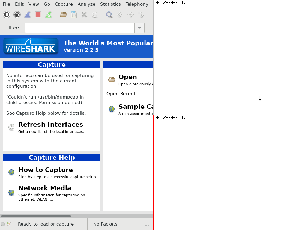
Who needs Firefox when you’ve got wget?
If you’re one of those weirdos who use a portrait screen, you can turn the whole thing on its side with the keyboard shortcut that changes the tiling layout.

This is obviously suboptimal on a normal screen.
You can use this same layout changing feature to temporarily fullscreen one window.

Linux: a slightly smaller set of poorly debugged device drivers for running your web browser.
While only three layouts (horizontal, vertical and single-window-fullscreen) are available by default, you can install many others and even write your own, allowing you to make your windows arrange themselves in any way you want, from the foursquare example shown in the previous section to a fibonacci pattern, if you’re into that sort of thing.
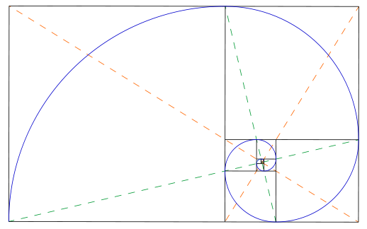
Cool but impractical.
And because your windows are all tiled rather than just floating around, if you resize one window, others will automatically expand to fill the space. Hope you weren’t too fond of that desktop wallpaper.
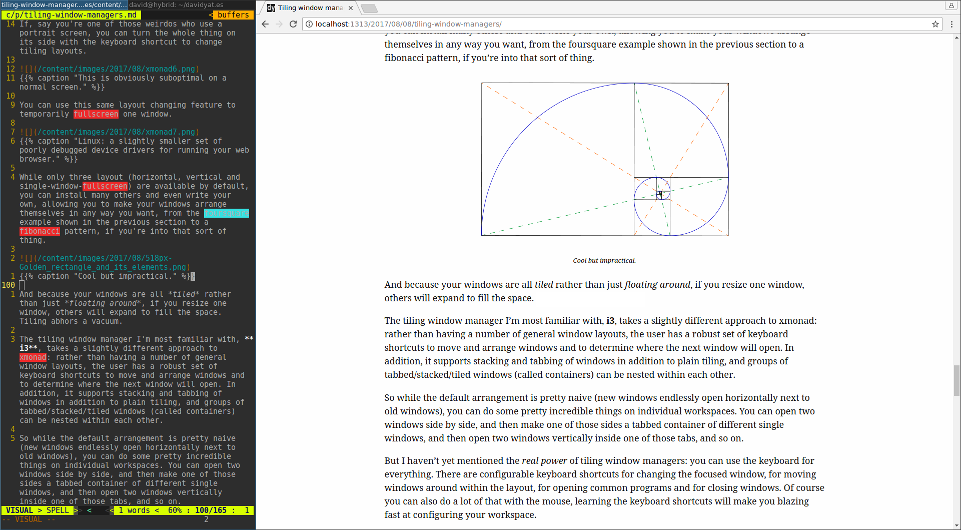
Tiling abhors a vacuum.
The tiling window manager I’m most familiar with, i3, takes a different approach to window arrangement from xmonad: rather than having you toggle between layout presets for the entire workspace, you can dynamically dictate where the next window will open and have a lot of minute control over the movement of existing windows. In addition to standard tiling, you can stack and tab windows. And groups of tabbed/stacked/tiled windows (called containers) can be nested within each other.
So while the default arrangement is less convenient than xmonad’s (new windows endlessly open horizontally next to old windows), you can create some very complex and useful layouts on individual workspaces. You can open two windows side by side, and then make one of those sides a tabbed container of different single windows, and then open two windows vertically inside one of those tabs, and so on.
But I haven’t yet mentioned the real power of tiling window managers: you can use the keyboard for everything. There are configurable keyboard shortcuts for changing the focused window, for moving windows around within the layout, for opening common programs and for closing windows. Of course you can also do a lot of that with the mouse,2 but learning the keyboard shortcuts will make you blazing fast at configuring your workspace.
Lastly, most modern tiling window managers support floating windows in some capacity, because every now and then you need to click through an alert box or use the GIMP.3
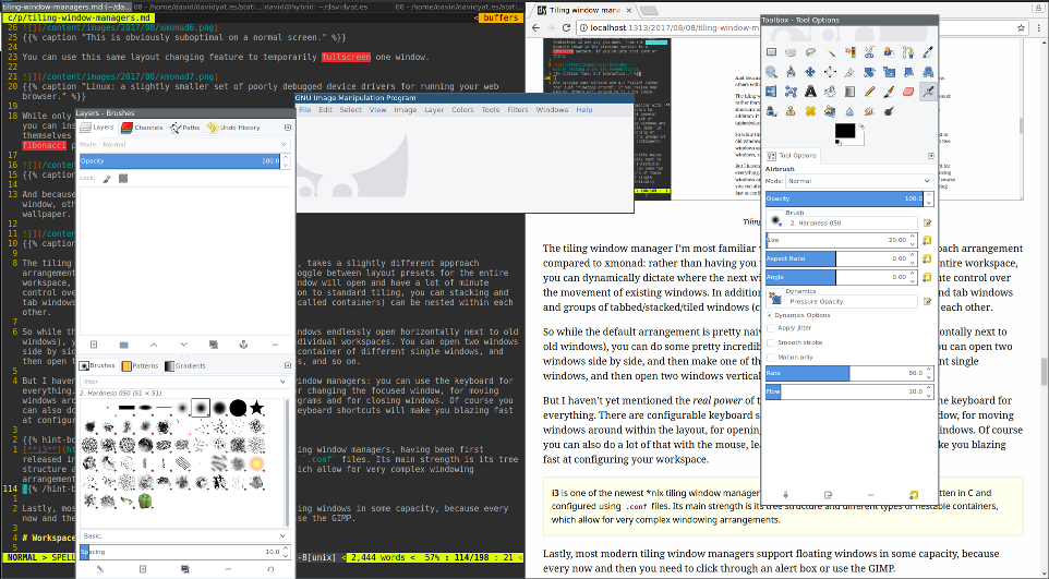
The beast that would not tile.
# Workspaces
We’re still getting to the real power of tiling window managers: workspaces. You can have as many as you want, place them where you want, and fill them with what you want.
Most modern Linux floating/compositing window managers such as Gnome 3 and dearly departed Unity (and as of Windows 10 also the Redmond Beast’s own dwm.exe) have the concept of workspaces or desktops. The idea is usually that you can open a whole bunch of windows on one workspace (let’s say a browser and notepad), and then move to another workspace and open a whole bunch of other windows (maybe a music player and an IM client), and thereafter move back and forth at will, without having to laboriously reopen and rearrange your window layout every time you switch tasks.
Workspaces function about the same on tiling window managers, until you add a second screen into the mix. Then, you’ll find that on a conventional WM a single workspace encompasses your entire display real estate – i.e. on workspace 1 you can put your browser on your left screen and your notepad on your right screen and on workspace 2 you can put your music player on your left screen and your IM client on your right screen.
In tiling world, things are a little different. A workspace only encompasses a single screen, giving you way more flexibility. For example, you could keep workspaces 1, 2, 3 and 4 on your left screen, and just workspaces 5 and 6 on your right screen, switching between them independently. This is incredibly convenient if, for example, you want to keep some documentation and/or an IM window visible while you switch between a bunch of different primary tasks. You can also move workspaces between displays.

One minute I’m writing my blog and googling important references…

…next minute I’m writing my blog and watching rainbow poptart cat…

…and then back to researching.
More mainstream WMs often (but not always) limit you to a hard maximum number of workspaces somewhere between three and nine. With tiling WMs, you can have an arbitrary number of workspaces, which can all have names. I like to use 10 general-purpose numbered workspaces (accessed via Mod+1–04) and a couple of specific ones like music (Mod+m, for music players) and guest (Mod+g, for KVM & Synergy). I’ve also seen people use a hybrid approach with workspace names like 1: web, 2: email, 3: code. If you’re really organised you can even make specific programs start on specific workspaces as soon as you log in (I do this with my guest workspace for quick access to my Windows gaming VM).
Some tiling window managers, such as awesome, wmii and dwm, use the concept of tags to organise workspaces. Individual windows can be tagged with one or more workspaces, and all windows tagged with a given workspace will appear there. So you can do things like have the same terminal window on the right side of workspace 1, in the corner workspace of 2 and floating in the middle of workspace 3.
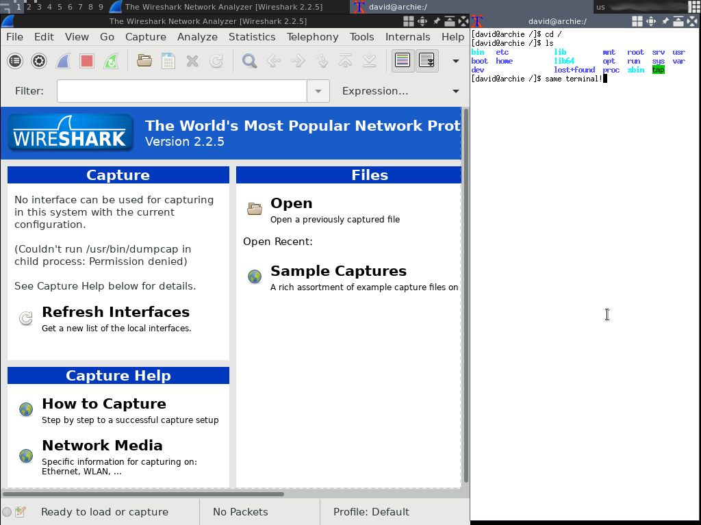
awesome is one of the more GUI-intensive tiling WMs, with lots of clickable buttons.
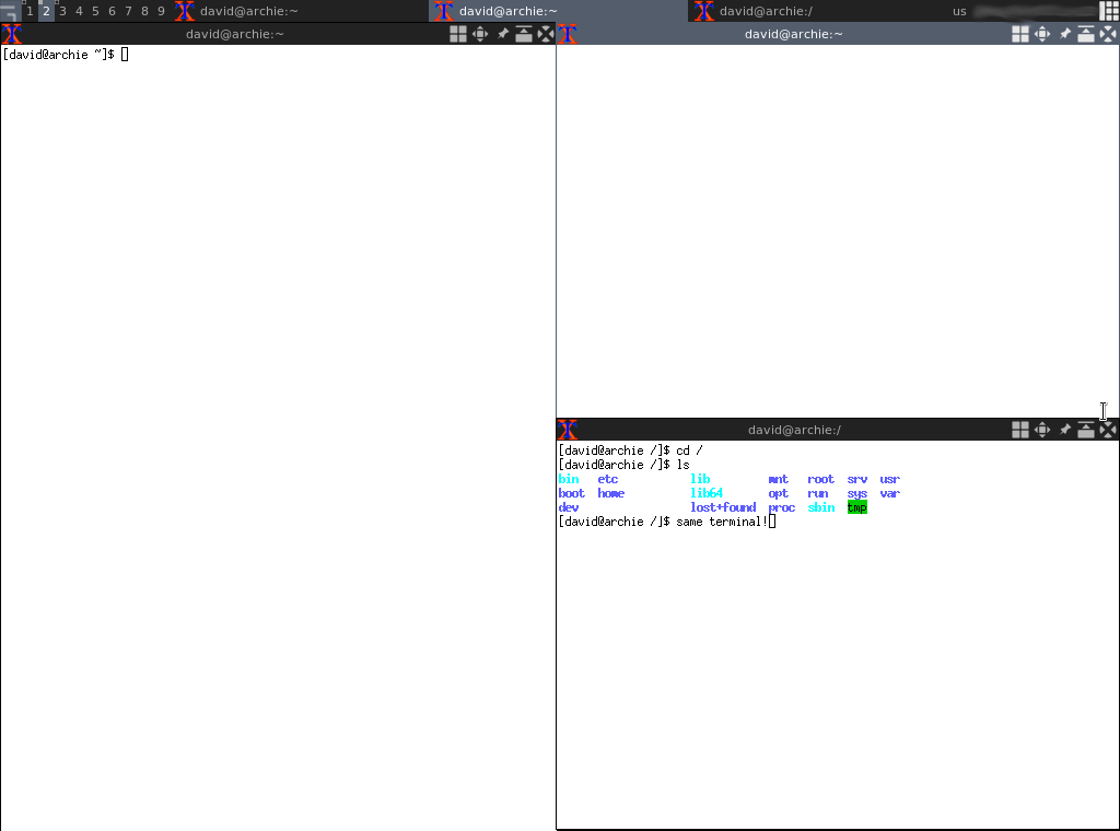
Yay, terminals!
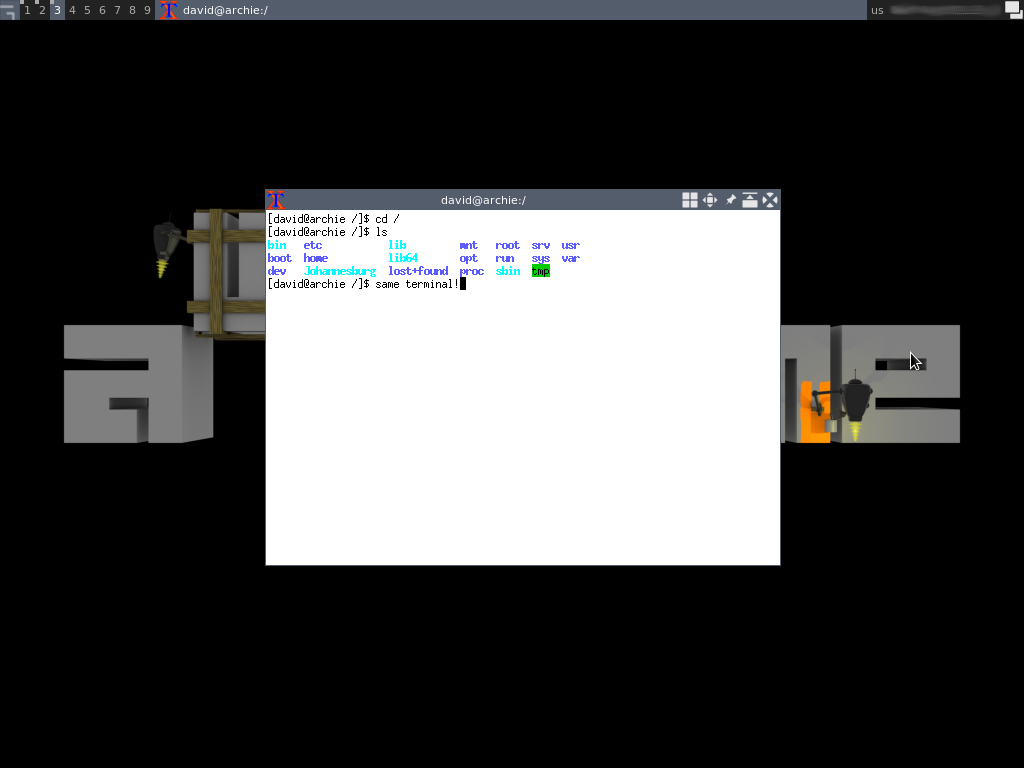
Sometimes you just want a floating window.
# Speed & minimalism
For serious now: the real power of tiling windows managers has to be that they are uniformly simple, fast and very light on system resources. Not only do they not have to animate windows flying around the screen and incrementally resizing, but they generally lack the superfluous and downright wasteful swishing and swiping and growing and shrinking of most “user friendly” interfaces.5
If, like me, you think that flat, minimalist design was the best thing to come out of tech this decade,6 you can very easily make your tiling window manager a perfect example of the aesthetic – most are this right out of the box, coming equipped with a flat (optional) infobar and single-colour, pixel-width window borders. Because everything is controlled by the keyboard most of the time, the interface can dispense with unsightly window tile bars, desktop icons and buttons in general. This is also great for making your PC entirely unusable to other people.7
Furthermore, the tiling world’s preferred program launcher is dmenu, which looks like this:

You press a shortcut key, type until the program you want comes up and press Enter to launch it. Which is how most people use program menus these days anyway. dmenu just cuts out the superfluous clicky icon menu part and uses a suitably tiny amount of screen space.
Of the WMs I’ve mentioned so far, awesome is the least minimal interface-wise, with many titlebar buttons, taskbar and other clickable GUI features enabled in its default configuration. But even so, all of these elements are minimally designed and animated, and it still manages to be pretty snappy – plus it’s configurable enough that you can disable or modify any elements you don’t like.
# Wrap up
Of the three points above, only the first is inseparable from the tiling concept. A standard floating window manager could include flexible and/or tag-based workspaces and there’s nothing about floating windows that precludes speed and minimalism. But I don’t know of any that do the former,8 and I’ve never encountered a tiling window manager that felt sluggish or bloated, so I felt the points were warranted.
“David, you have convinced that tiling window managers are the perfect human-computer interface,” I hear you say, “but which one should I choose?”
To recap, the three I’ve mainly discussed above are xmonad, i3 and awesome. There are others, like dwm, wmii, ratpoison and etcetera,9 but they aren’t quite as popular. So let’s start by narrowing it down to the first three.10
Use xmonad if you:
- want your windows arranged in a small set of sensible layouts automatically.
- really dig Haskell and want to moreoreless build your own WM with it (out of the box, xmonad has a lot of hidden features you’ll need to write some Haskell to take full advantage of – this includes tag-based workspaces).
Use i3 if you:
- like to have a lot of control and dynamic layout options involving tabbing and nesting.
- would rather deal with
.conffiles than Haskell or Lua scripts. - aren’t interested in the tag-based workspace thing.
Use awesome if you:
- want your windows arranged in a large set of sensible layouts automatically.
- want programmatic extensibility like xmonad’s but don’t like Haskell.
- like to have the option of using the mouse for everything.
- love the idea of tag-based workspaces.11
The only real way to know the answer to many of these questions is to actually install each of the different window managers and try to use them. So I recommend doing that. As mentioned earlier, I personally use i3.
There’s a lot I haven’t covered in this post, but this should be enough to explain why tiling managers exist and get you thinking about your own workflows. Floating window management is a bit like one-size-fits-all clothing: on some people it fits great, on others it’s technically wearable but something tailored would be better.
Or learn the keyboard shortcuts, which I’m assured do exist… somewhere. ↩︎
One mouse-based default configuration common to tiling window managers is the controversial, love-it-or-hate-it “focus follows mouse”. This means that whatever window your cursor is over instantly gains focus without you having to click. It really depends on you whether this is awesome or highly irritating. ↩︎
Since writing this article, I’ve discovered that the GIMP can be made to stick to one window like a normal program through the menu option Windows → Single-Window Mode. ↩︎
Most sensible tiling WM keyboard shortcut schemes involve a
Modkey. I always use theWin/Superkey for this, as individual programs generally don’t use that for anything so there’s little risk of shorcut collisions, but you can also useCtrlorAlt. ↩︎The greatest trick GUI animation ever pulled was convincing the world it wasn’t just lag dressed up nice. ↩︎
Every night I dance upon the overly detailed grave of skeuomorphism. ↩︎
Between my window manager and my capless keyboard, I almost don’t have to use a lockscreen. ↩︎
If you do, please tell me! ↩︎
We can talk about Wayland in a few years’ time when people are actually using it. ↩︎
If you’re a Windows user… you’re out of luck for now, but I will be taking a look at tiling window managers for Windows in a future post. ↩︎
If you hate the second point but like the third, you might be a dwm person. ↩︎
 David Yates.