As a technical person who enjoys doing various types of writing, I’ve got some strong opinions on the tools I use to write. There was a time when I did the bulk of my writing physically, with a pen and stacks of paper (sacrificed three pens to Nanowrimo ‘08) but as my typing ability has improved and my handwriting further deteriorates (and it was pretty awful to begin with) I’ve moved to writing exclusively on the PC.1 And in the time I’ve been writing like that, I’ve tried a number of different writing programs of different descriptions.
The most obvious choice for a writing tool on a modern computer, and the one you’ll find most people using, is Microsoft Word or its free, open-source clone, LibreOffice Writer. You get a page, you can type words on it, and you can format those words in various ways and add images, tables, footers, headers, references, cover pages, shapes, textboxes and macros, all using an intuitive interface that assures you that What You See Is What You Get.

But I have two big problems with Word and programs like it: complexity and hidden complexity. By which I mean, briefly, that (1) there are more features than I really need and (2) ease-of-use comes at the cost of usability.
Complexity: What sort of capabilities you require of your writing tools depend, obviously, on what sort of stuff you write. My writing output for the moment is mostly blog posts and the occasional story. For the latter, I need the ability to enter text, and maybe italic type. The former tend to be more formatting heavy, but said formatting is handled by some manner of web markup language, and so I don’t even need italic type anymore.2
So there’s little point in having this whole complicated load of options in the ribbon at the top if I’m never even going to use them. Sure, I can hide the ribbon, but ultimately I’m still regularly starting up and using a chainsaw to pick flowers.
Hidden complexity: When I do want to make a complex document with lots of formatting and images and tables, Word becomes very quickly becomes unwieldy. As a side-effect of being so easy to use and providing such pretty, intuitive output with no ugly markup, it hides a lot of complexity from the user. It’s very easy to get into bizarre situations and have Word completely muck up your careful formatting and refuse to do what you tell it to because there’s something going on in the document you can’t see.
You could accidentally make a 28pt, bold-italic space or newline character in the middle of nowhere and have that completely wreck your formatting, because a bold-italic space looks pretty similar to a normal space, and you can’t always tell the difference between automatic paragraph spacing and a manual newline at a glance. Similarly, any programmatic templating changes that would be trivial to achieve were your document written in plain text with Markdown, HTML or LaTeX become a tedious headache of repetitious manual adjustment in MS Word.
And don’t even remind me of the pains of editing MS Word
.docxfiles in LibreOffice – it’s very easy to completely lose bits of text and formatting between saves.
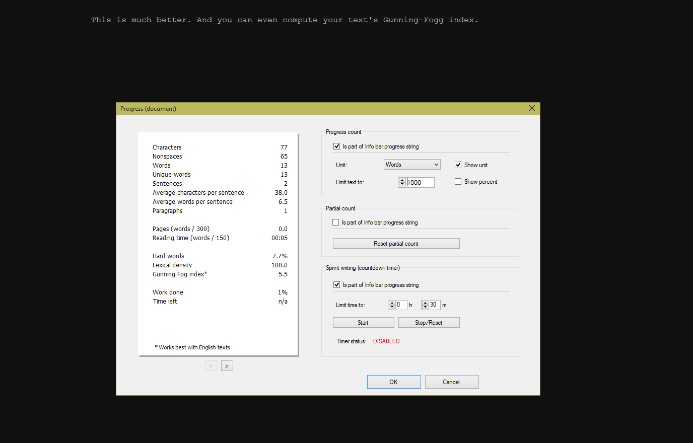
I’ve found I write best and most efficiently when faced with minimal distractions. If I can just a single colour screen (preferably dark grey or black) with single colour text (preferably light grey), I can type away happily for hours. It also helps to unplug my Internet connection. That revelation led to my discovering WriteMonkey, a minimal Windows writing program with a surprising featureset under the hood, and FocusWriter, a similar program that works on Linux as well.

For a counterpoint, I tried out yWriter5, the least minimalist piece of writing software I’ve yet encountered. I very quickly discovered it wasn’t for me. I don’t want to bash the creator of yWriter or anyone who makes successful use of it, but my immediate reaction to the interface was one of fatigue.
You see, yWriter encourages the user to split their writing up into individual sections or scenes, and for each scene, there’s approximately one billion metadata fields and checkboxes and sliders that can be set, covering characters, mood, time, place and a thousand other little details. Seeing as yWriter doesn’t have a particularly nice interface for actually writing, it appears that the organisational metadata stuff is supposed to be its killer feature – again, I’m sure it works well for some, but just looking at all the forms makes me tired. I feel like I’d spend more time entering lists of appearing characters and adjusting mood sliders than actually writing, and that’s the death knell for a writing program, as far as I’m concerned.
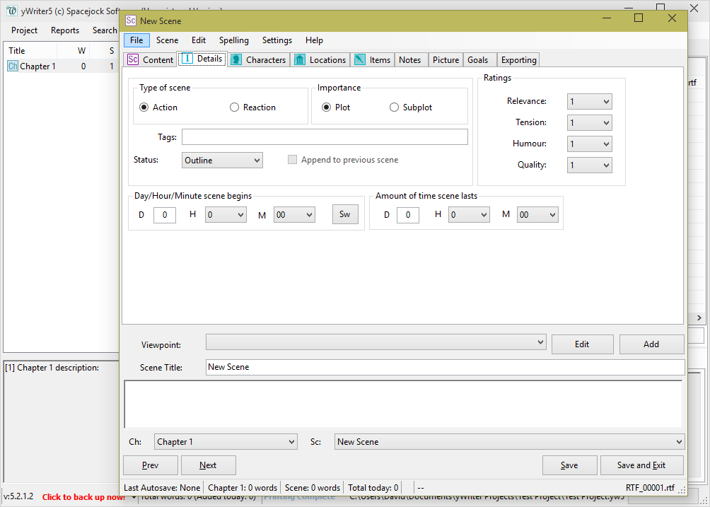
Still, a dutifully maintained yWriter project must be able to generate some neat stats. But if you’re not going to use any of the metadata fields, using the program at all seems a waste, especially if you happen to be enamoured with full-screen, distraction-free programs. The program’s exclusive focus on fictional novel-writing projects also feels a little limiting – I’d like to be able to use my writing software for more than just one very specific type of writing project.
And so, for a time, all was well. I used my minimalist distraction-free writing environments, and saved individual pieces and chapters in neatly maintained folder hierarchies, many of said folders having descriptive names like “Scrap”, “Stuff”, “Misc” and “Old”. But I didn’t really realise that any of that was a problem until I tried out my next writing environment: Scrivener.
Scrivener is a hipster writing program originally developed (obviously) for OSX. It markets itself as basically an IDE for writers, and is one of those thirty-day-free-trial premium pieces of software you see every now and then. For that reason, and because of my experience with yWriter, I initially did not even consider using it.
But it ultimately doesn’t take too much to get me to try out new software. A few months ago, I found out about the Linux public beta of Scrivener, which is, for the moment, free, if somewhat unstable and missing a few features.

It only took me a little poking around to find that the program had exactly the kind of full screen, distraction-free writing mode. That significantly increased my interest in the program.
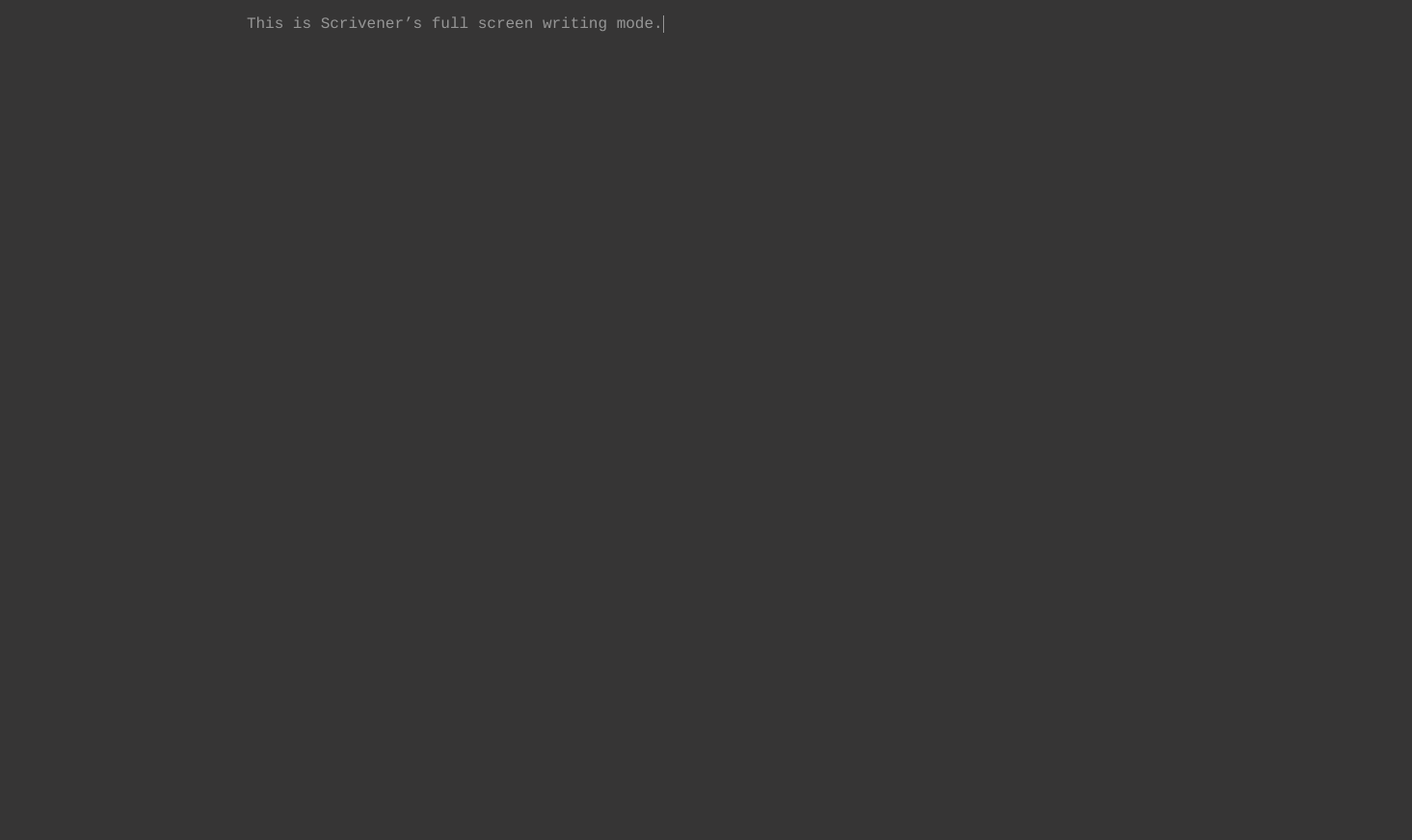
And from there on out, I discovered even more things to like – stuff I didn’t even realise I wanted until I tried it out:
Corkboard organisation: Scrivener’s most unique and recognisable feature is the corkboard. Each project can be arranged in hierarchial sections, with subsections going as deep as you’d like and no built-in semantic names for those subsections (i.e. if you want to put Part I, Part II and Part III inside Chapter 4, that’s totally your choice). These sections and subsections are represented as index cards on a corkboard, which provides an intuitive, graphical way to order and reorder things within your structure, if, like me, you don’t always write exactly sequentially.
Index cards can also be labelled (the purple ribbon) and given statuses (the red watermark). Some general labels and statuses are provided, but you’re free to add your own and even modify the existing ones.
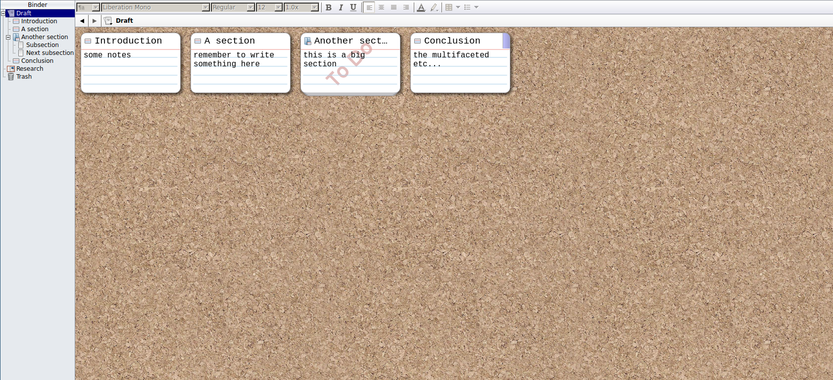
The project binder: There’s a lot to be said for plain, old-fashioned OS filesystem organisation, and I tend to prefer it when programs stick to doing one thing well and don’t try to implement an interior library or filesystem. But there are exceptions. The OS filesystems I use don’t have features for the kind of persistent arbitrary ordering you can do with the Scrivener corkboard and binder (the name given to the collection of all files in a given project), nor would I want them to.
What’s more, Scrivener’s project binder doesn’t just allow you to store your project’s actual text – you can include arbitrary notes and even images, PDFs, videos and audio files, all of which you can view/listen to within the program itself. It’s a very neat way to keep a mess of different stuff you might need for a particular project in a central, quickly accessible place.
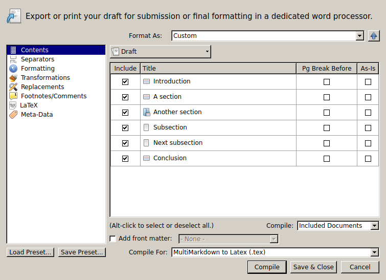
Export options: When you’re done writing, Scrivener allows you to compile your document into a vast array of different formats for publishing and distribution. You can format for print or for PDF, produce a LaTeX file3 or an ePub book, or even a Word document. And you can do all of these things for the same project.
Scrivener also boasts functions for inline comments and a robust metadata system that you could use to turn your project into a yWriter-esque beast, heavily laden with tension ratings, timespans and character appearances. But only if you want to.
The tool’s own manual says it best:
Most word processors and text editors aimed at writers assume the creative process will take place in linear form; that is, they assume that the writer knows how his or her work will begin and will start at the beginning and continue through until reaching the end, and for those that do work that way, they assume that a linear form is a useful format for a text that spans hundreds of pages. Planning and restructuring is therefore forced into a separate workflow.
[…]
Scrivener is part of a new breed of writing software which focusses more on providing a solid open-ended writing tool (as the word processor does) rather than a writing process, which presumes a system upon you. As with a word processor, there are no chapters or sections or scenes; how you use the software determines these things, not some feature baked into the program. Scrivener’s design is fairly unique in that it easily provides a platform for writers of many philosophies and disciplines. It’s a tool that works equally well for a doctoral dissertation, as it does for writing a short story or a screenplay.
Excerpt from “Chapter 1: Philosophy”, Scrivener 1.7 User Manual (emphasis mine)
And that’s why it works for me.
Scrivener is a highly polished, very well thought-out writing environment. It provides a large variety of features in many different areas (organisation, publishing, and writing itself), many of which you probably never realised you’d love to have. There are some missing features that I’d like, such as a plain-text editor mode (I prefer to only have to worry about things like fonts and paragraph spacing at compile time), but overall I’m very happy with the program and will continue to use it when the opportunity presents itself.
I didn’t think there was a need for a program which supported the meta, organisational aspects of the writing process, but I hadn’t seen one that did it well before, while at the same time providing a good interface for the actual writing part. I might even purchase a licence once the beta finishes, if I use it enough. Highly recommended for anyone with a Linux operating system and large-ish writing project or two.
I also used to write at significant length on my old Blackberry phones – was faster at those than the keyboard for a long stretch of time. In many ways I miss physical keypads on phones. ↩︎
I usually use Ghost’s excellent post-writing interface for blog posts these days. It takes a two-pane approach, with a Markdown plaintext editor in one pane and a formatted preview in the other, effortlessly gaining the best of both the WYSIWYG and markup approaches to text editing. But that’s only available when I’m online (although there is a way to get the text editor4 Atom to do something similar). ↩︎
LaTeX and its associated programs omitted from this article due to length concerns. I consider them more about writing presentation than about writing itself. That said, LyX got me through my Honours thesis with fairly minimal hassle. ↩︎
Although they are technically writing programs, programmer’s text editors really deserve their own separate post (or post series). ↩︎
 David Yates.